


As digital products evolve and design teams scale, maintaining a unified look and feel becomes challenging.
A UX style guide centralizes design rules, components and principles to shape your solution.
For leaders looking to create successful products, a UX guide can turn a costly process into growth opportunities. Let's find out how!
What is a Style Guide?
A style guide is a documented, centralized repository with rules and product assets.
These guides promote cohesive visual identities, including brand voice, logo guidelines, color choices and typographic rules.
Clear style guidelines can streamline decision-making as teams don't have to rethink design choices.
Businesses with clear guidelines can also work more efficiently because everyone knows how products should look and function.
This enables adding new features faster and with fewer errors, providing a clear workflow from design to code.
As a result, companies can deliver more reliable products while speeding up time to market.
Also, consider that as products evolve, they tend to become more complex and integrating new technologies becomes a challenge.
Style guides ensure keeping consistent and easy-to-use experiences that work as intended for everyone.

Types of Style Guides
Visual Design Style Guide
This guide dictates a product's aesthetic identity (what users see), ensuring brand recognition, color harmony, and consistency. It includes:
- Color System: Formalized color palettes (primary, secondary, semantic) with accessibility compliance.
- Typography: Clear order of font style families, sizes, weights, and spacing.
- Images and Icons: Authorized styles, usage contexts, and technical specifications.
- Layout Principles: Structural grids, Responsive Design behaviors, and spatial scales.
- Visual Component Standards: Definitive styling for UI elements in all interaction states.
Content Style Guide
Content style guides define the voice, tone, and language, outlining how your product communicates with users.
This guide builds trust through consistent and clear messaging. It includes:
- Brand Voice and Tone: How to consistently apply brand personality in all interactions with users.
- Language Rules: Approved lexicon, grammar rules, and inclusive language standards.
- Microcopy Frameworks: Templates for interface text, notifications, and instructional content.
- Accessibility Language: Required rules for descriptions and screen reader support.
- Content Model Governance: Guidelines for writing extended pieces or promotional content.

What is a Style Guide UI UX?
A style guide UI UX defines how your product should work and look, including User Experience (UX) and User Interface (UI).
The UI guide defines appearance and behavior to ensure seamless adaptation across devices.
Conversely, the UX guide manages the architecture of interactions, such as navigation menus.
Together, UI and UX codify your product's identity and reflect your brand's core values through consistent implementation.
For leaders, this guide is foundational rather than just decorative.
A UX style guide enables scalable quality, transforming subjective decisions into reusable systems that guide development and ensure coherence.
Additionally, UX guides fortify against UX fragmentation when products evolve and teams expand.
This prevents disjointed experiences that impact user trust and operational efficiency.
UX Style Guide and Brand Style Guides
A UX style guide delves into aesthetics and functionality.
Conversely, brand style guidelines preserve the brand's User Experience, including color schemes, voice and UI elements.
Linking UX and brand guidelines ensures consistent user flows, allowing users to complete actions while internalizing brand identity.
Design guidelines translate abstract values, such as "trustworthiness" or "intuitiveness," into actual behavioral language.
Consider Snapchat's 2018 redesign, which triggered abrupt navigation changes and garnered over 1.2 million user petitions.
Users found the redesign unintuitive, negatively impacting brand loyalty and resulting in a $1.3 billion loss.
That's how crucial the UX style guide is to ensuring every flow reinforces your brand's reliability.
For leaders, this acts as protection, turning consistent user behavior into market strength.

Benefits of a Style Guide UX UI
1. Optimization
Without standardized interaction patterns, every new feature or screen reinvents the wheel.
For example, when designers add a button, they know how it looks (colors and shape) and how it behaves when a user clicks it.
Not having to redesign behaviors from scratch results in improved resource utilization.
However, teams must test the impact of style guides by gathering user feedback through interviews or surveys.
Measuring usability enables the optimization of style guides to enhance customer satisfaction and experience.
As a result, teams have proven solutions, moving from subjective decisions to reusable systems.
2. Consistency
A style guide for UI/UX Design mandates uniform logic for navigation, feedback, and task flows.
Consider that consistency is not, in itself, enough to gain user trust.
Solutions must adhere to brand guidelines while meeting accessibility and usability standards.
This reduces cognitive load and uncertainties from a user's point of view.
When a solution meets all these criteria, users feel less lost and are more likely to return.

3. Innovation
As mentioned above, a UX style guide provides elements that teams know for sure users love and use.
However, when you don't have well-defined elements, teams waste resources rediscovering and redesigning basic features.
This results in fewer available resources to spend on creating more refined, innovative solutions.
Having a UX style guide frees UX/UI Designers to focus resources on improving and solving new user problems.
4. Accessibility
A proper UX style guide integrates Web Content Accessibility Guidelines (WCAG) best practices from the start.
For example, designing for users who rely on keyboards is not a nice-to-have; it's a must-have.
A style guide includes rules for scrollable content, keyboard-activated buttons, and skip links.
It can also include guides for color contrast, adjustable font sizes and how to integrate assistive technologies.
Likewise, teams can leverage AI accessibility to ensure compliance across screens, devices and solutions.
These practices not only make your product more accessible to people with disabilities but also enhance the overall experience.
Accessible design is a moral and legal obligation. In fact, ADA compliance can help reduce legal risks and fines that can exceed $150,000!

5. Execution
A style guide acts as a binding contract: "This is how our product behaves."
It reduces misinterpretation and ensures every release delivers a consistent and coherent experience.
For Front-End developers, it provides access to hex codes for colors, UI components, and other assets. This simplifies writing CSS and HTML code.
Conversely, for UX Designers, it ensures designing responsive layouts that align with the brand's style.
However, that's not all; content writers use style guides to produce content that aligns with the brand's tone of voice.
How to Create a Style Guide UI UX?
1. Define
Start by establishing the core visual design elements that will anchor your entire design system.
Choose your typography wisely, as it can help catch the attention of users even before they start reading.
Clear typographic rules, such as type, sizes and weights, also promote visual hierarchy and improve readability.
When used correctly, typography is a crucial element that differentiates you from the competition.
Also, a proper line spacing determines how the audience perceives your message.
For example, generous line spacing can express openness and clarity. Conversely, cramped spacing looks dense and can be difficult to read.
Spacing varies depending on the typography and content type, but it typically ranges from 1.2 to 1.5 times the font size.
Choose primary and secondary typefaces that reflect your brand's personality while ensuring cross-platform readability.
Also, define font sizes for different visual hierarchy levels, like page titles, section headings, subheadings, body text, and captions.
Ensure your color palette has primary colors that represent your brand's identity and secondary colors that enhance its functionality.
Also, include system colors for different states, such as success messages, error messages, warnings, and informational content.
Don't forget to document exact hex codes, color combinations, and specify when each color should be used.
2. Document
Create comprehensive specifications for every interactive element users will encounter.
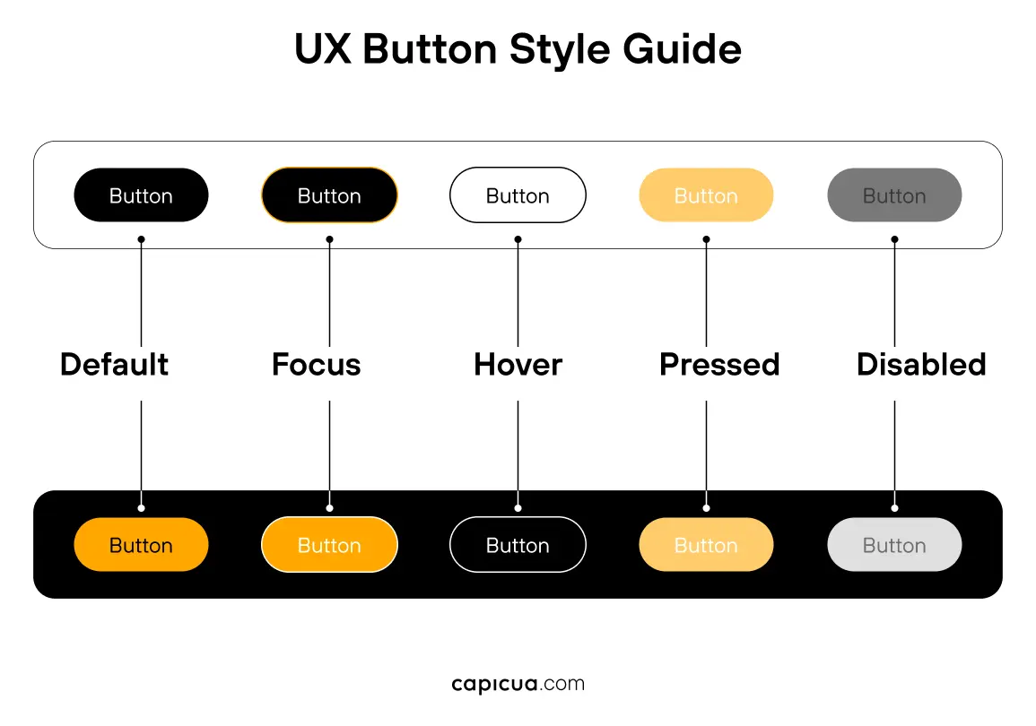
For example, buttons should display interactive states, such as default appearance, hover effects, active states, and disabled conditions.
You can also define different button sizes and specify which size serves which purpose.
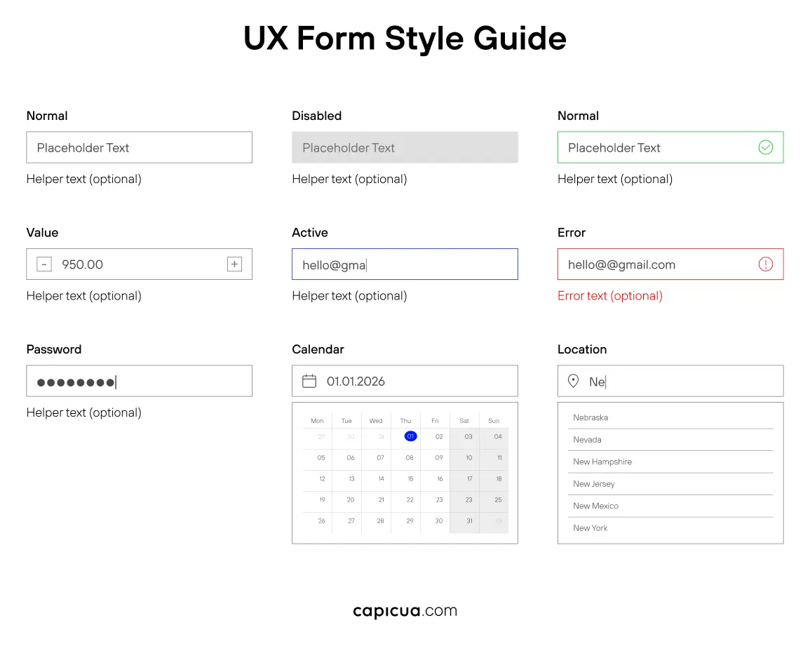
Similarly, forms require guidelines to cover input fields, drop-down menus, checkboxes, radio buttons, and text areas.
Ensure you specify how these elements behave during user interaction and how they communicate errors or validation messages.
Each component should clearly outline its appearance, behavior, and intended use to avoid inconsistencies.
3. Establish
Define a spacing system using consistent increments, like the 4-grid system, to arrange UI elements with precision and accuracy.
As its name suggests, the 4-grid system employs a divisible-by-4 scale when creating space between elements.
This system should govern margins, padding, and space between elements.
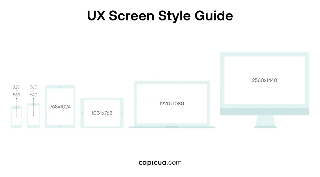
Specify layout responsive grid systems that provide structure for different screen sizes and device types.
These standards ensure consistent page structure and spacing between components, promoting visual harmony.
4. Create
Convert your visual guidelines into clear, easy-to-follow instructions, such as when to use specific colors or typography.
You can also create decision trees or flowcharts to select the appropriate components according to the scenario.
Include examples of correct usage alongside common mistakes to avoid. This eliminates guesswork and ensures consistency.
5. Build
Create component libraries that include all variations and states for elements in design tools like Figma.
Likewise, provide code snippets or development guidelines to ensure components are implemented correctly.
You can also include CSS specifications, naming conventions, and technical requirements.
Develop icon libraries with consistent visual styles, sizing guidelines, and usage specifications.
These elements should align with your overall visual language while serving clear functional purposes.
Your assets should guide team members in easily finding and using components, preventing inconsistent custom variations.
6. Maintain
A style guide requires ongoing attention to remain relevant and useful as your product grows.
Review processes assess new design decisions against existing guidelines.
You can create procedures that work for your team for updating the guide when legitimate needs arise for modifications.
Implementing version control to track changes and communicate updates ensures team alignment on current guidelines.
Lastly, plan for growth. Proper guidelines can include new features, platforms, or brand changes.
Conclusion
Fragmented interfaces can quickly become major disadvantages as your product scales!
That's why having a well-crafted UX style guide transforms pitfalls into systematic advantages.
Our experience as a Product Growth Partner has shown us that having clear style guides ensures successful digital interfaces.
Get in touch to build a style guide that scales with your ambitions!