


The most expensive reasons people leave or abandon a digital product have nothing to do with the product. Baymard Institute states that 19% of US online shoppers abandon a purchase because they don't trust the site, 18% because the site insists on account creation, 17% because the flow felt too long or complicated, and 12% because they couldn't see or calculate the total cost up front. Each reason users leave a site is a question the interface failed to answer, and UX writing is the discipline that answers it.
Teams invest heavily in flows, components, and design systems, then ship a button that says "Submit" and an error that says "Something went wrong." What they don't consider is that the words inside an interface are the cheapest lever available on activation, support, and retention, and the one most likely to be handled by whoever touched the screen last.
This guide covers what is UX writing, what is a UX writer responsible for, how UX writing vs copywriting actually differs, the UX writing best practices that change product metrics, and how to improve UX writing when there is no content team on the org chart. It also covers what is UX copywriting and where UX copywriting sits between the two disciplines.

What is UX Writing in Software and Digital Products?
UX writing is the practice of creating clear, concise, contextually appropriate copy that guides people through an experience, with an emphasis on the word guides. According to the Nielsen Norman Group, UX writing covers interface copy such as buttons, navigation labels, and error messages, microcopy such as headlines, summaries, and metadata, and longer-form in-product content such as help articles and onboarding sequences.
The unit of work is small, with NN/g defining microcopy as copy shorter than three sentences, classified by the goal it serves beyond where it sits on the screen. Informational microcopy educates so a user can decide, influential microcopy encourages one specific action, and interaction microcopy gives feedback on an action or reports system state. A tooltip, a tagline, and a field label can all look similar yet do completely different jobs.
However, the stakes come from how little of it gets read. NN/g eyetracking work puts the share of on-page text people actually read at roughly 20% to 28%. Users scan, land mid-page, and decide in fragments; the words that survive that behavior carry the product, which is why content design belongs in the same conversation as interaction design more than it belongs in the marketing backlog. To summarize, UX writing decisions calcify into architecture faster than most teams expect.
UX Writing vs Copywriting: What Is the Difference?
The difference between UX writing vs copywriting is the job each one is hired to do. While UX writing helps a person complete a task inside a product, copywriting persuades them to take a commercial action around it. Both are written in the brand voice, both can be measured, and both fail in ways the other cannot fix.
But what is UX copywriting? UX copywriting is the overlap: copy inside the product that carries both a conversion goal and a usability goal. This copy that encourages an immediate digital action while balancing user needs against business goals is called influential microcopy, and includes upgrade prompts, trial-expiry banners, and plan-selection screens, among others. These copy items live inside the product, so they answer to task success, and they carry revenue, so they answer to conversion too.
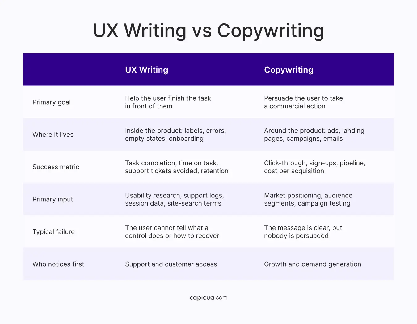
Content strategy sits above both, with Kristina Halvorson defining it as setting up an intentional plan, practice, and process to reach specific goals with content over time, and notes that more organizations now invest in two separate roles. Content strategists set the processes, style guides, and governance, and UX writers work inside them and push changes back up. Hiring a copywriter to fix confusing error messages produces persuasive error messages. The skills diverge when you have to decide what to cut.

What is a UX Writer and What Do They Own?
A UX writer is the person accountable for the words a user reads inside the product. While asking what is a UX writer usually brings up a job description full of verbs, the honest answer is narrower: a UX writer owns the decisions about what the product says, just as a designer owns what it looks like and an engineer owns what it does.
The UX writer role's core activities are writing and editing copy and publishing content, with three focus areas: clarity and concision, consistency, and collaboration with design. In a product organization, this translates into concrete ownership:
- UI copy across empty, loading, partial, error, permission-denied, and success states.
- Voice and tone that show how the product sounds when something goes wrong.
- The mapping between what the company calls a thing and what customers call it.
- Text accessibility such as labels, link text, button text, and alt text: writing outputs before engineering outputs.
- Copy testing, including the variants that go into usability sessions alongside the flows.
As with most roles, UX writing is changing fast, with AI increasingly positioned as a capable first-draft collaborator for variations, alt text, and microcopy brainstorming. However, there's also the risk of generic, trend-based outputs, brand voice drift, and outcomes with no knowledge of specific users, research, or context. The judgment calls (knowing what to cut, calibrating tone, and recognizing how different users interact with the content) stay human. Teams exploring generative interfaces face a sharper version: copy that is assembled at runtime still has to sound like a single product.

UX Writing Best Practices for Product Teams
The UX writing best practices that change product metrics are the ones a team can apply without a rebrand, with seven key practices that hold up:
- Order the priorities: NN/g's three C's (clarity, concision, character) put clarity first because copy that fails to inform has already failed, concision second because it determines whether the copy is read, and character third because personality that obstructs comprehension is a cost.
- Write for a scanning reader: Target a sixth- to eighth-grade reading level for general audiences, but keep in mind that plain writing doesn't exclude experts. WCAG 3.1.5, updated in June 2026, frames the same threshold.
- Label every input and link: The WebAIM Million 2026 analysis found missing form input labels on 51% of the top one million home pages, empty links on 46.3%, empty buttons on 30.6%, and ambiguous link text such as click here or more on 15.2%.
- Error messages as recoverable next steps: WCAG 3.3.3 Error Suggestion requires that when an input error is detected automatically, and a correction is known, the user gets a suggestion. An error that reports a failure without a path out converts a two-second correction into a support ticket.
- Disclose cost, commitment, and consequence: Figures on trust, forced account creation, and hidden totals are all disclosure failures. Copy that states what happens next, what it costs, and what can be undone removes the hesitation.
- Document voice and tone per state: Voice is the organization's personality and stays consistent, and tone is how that voice adapts to a situation. The states to write down are the ones where tone carries the most risk: failure, billing, deletion, and downgrade.
- Cut the form: Baymard's checkout research finds the average US checkout carries 23.48 form elements where 12 to 14 would do, and that most flows can remove 20% to 60% of their default visible fields.

How to Improve UX Writing
The answer to "How to improve UX writing" comes down to sequencing six moves that a product team can run inside two sprints. The constraint is usually that nobody has been told the words are theirs.
- Inventory the strings: Export the copy from your top three flows, such as sign-up, first-run, and your activation event. Most teams find between 80-200 strings and are surprised by how many they cannot attribute to a decision.
- Name one owner: One person, by name, with the authority to reject a string costs nothing and resolves most of the inconsistency on its own.
- Write a one-page guide: Voice attributes, banned words, tone shift for errors, and the terminology map. One page that gets used beats a thirty-page guide that does not.
- Test one variant: Add a copy variant to the next usability session you were already running. Two labels, same flow, five participants. Usability testing, first-click testing, cloze tests, and content-preference tests are great alternatives to eye-tracking.
- Accessibility pass: Run one pass that considers every unlabelled input, empty link, and click in the core flow. This pass tends to find something in almost every product.
- Move strings: Once copy is versioned like code, a change ships once instead of five times, and the compounding starts.
Baymard's benchmark found 65% performing at mediocre or worse, only 2% rated good, and an average potential conversion increase of 35% from fixing the remaining issues. Those issues are disproportionately about what the interface says, and teams that understand the psychology behind product decisions tend to close them faster because they start arguing about comprehension.
How UX Writing Affects SEO, AEO, and GEO Visibility
UX writing determines whether a product is legible to both machines and people. Search Engine Optimization ranks pages; Answer Engine Optimization structures content so assistants and voice search can extract a direct answer; and Generative Engine Optimization makes content authoritative and structured enough that generative models cite it. NN/g's practitioner FAQ makes the point that the underlying principles are the ones that already work for humans: lead with the answer, structure the page, and stop burying definitions.
Three constraints follow directly from UX writing practice. Page titles beyond roughly 60 characters are truncated in search results, and summaries and descriptions work to a 160-character limit. The inverted pyramid, which puts the conclusion first, matters more now than it did when a human was guaranteed to scroll.
Founders should also consider the measurement consequence of SEO/AEO/GEO-driven UX writing. There is a measurement consequence that founders should plan for. As AI previews intercept an increasing share of searches, websites shift from click destinations to sources AI tools quote. NN/g recommends shifting emphasis from raw traffic to engagement, conversion, task-completion rates, and return visits, and treating AI referral traffic as a rough and significantly under-representative signal. The same discipline that makes microcopy extractable by a screen reader makes it extractable by a model. Shared requirements include clear definitions, consistent terminology, and a structured hierarchy.
Confusing product copy is usually a symptom of an unresolved decision. When a team cannot name what a feature does in six words, the ambiguity goes upstream, and the label is just where it surfaced. Shaped Clarity™ is the lens Capicua uses to resolve that ambiguity before it reaches the interface, so the product can adapt and learn from users without relitigating the same wording every sprint. Discover more about Shaped Clarity and learn how products that can explain themselves can evolve.
Conclusion
The uncomfortable part of UX writing is how measurable it is. Abandonment reasons, unlabelled inputs, ambiguous links, and unrecoverable errors are counted, benchmarked, and published every year, and the numbers barely move. The products that win the comprehension battle do so because someone was made responsible for the words, given evidence to work from, and allowed to delete things.
Make your product easier to understand, faster to adopt, and cheaper to support: contact us or book a call.