

Design is at least as important as it was before AI. At least that's what 90% of interviewed product builders stated in Figma's 2026 AI Report, with nearly six in ten stating it matters more. However, the way teams create a user interface has changed more in the past 18 months than in the previous decade. Designers now ship code, engineers now design, and a prompt can produce a clickable screen before anyone has named the problem behind it.
Choosing how to create a user interface now decides how fast a team learns, how much it reworks, and whether a new surface feels like the product customers already trust. This guide breaks down the three methods teams use today, where AI to create user interface work earns its place, and the seven steps to create a user interface for a new application without inheriting a year of UI debt.

How To Create a User Interface for Software Products?
To create a user interface is to translate a product's jobs, data, and decisions into the screens, components, states, and interactions a person uses to get work done. The visual layer is the part everyone sees, but the structural layer, made of flows, states, and rules, decides whether the interface holds up once real data, edge cases, and new features arrive.
The cost of producing screens has collapsed while the cost of producing the wrong screens has stayed where it was. Figma's 2026 AI report found that designers participating in development doubled to 41% in a single year, while developers doing design work rose from 44% to 60%. When everyone on a product team can generate an interface, the scarce resource becomes the judgment about which interface should exist.
For a post-PMF SaaS company, a new interface rarely starts from a blank page: it inherits a brand, a component library, an accessibility baseline, and the mental models existing customers already carry. That's why the user interface design process in a scaling product weighs consistency and reversibility as heavily as speed.
Today, a user interface includes:
- Information architecture: how content and actions are grouped, labeled, and found.
- Interaction design: flows, states, feedback, and error recovery.
- Visual design: hierarchy, typography, color, and spacing, usually expressed as tokens.
- Content: labels, microcopy, and guidance, all elements of UX writing.
- Accessibility and performance: the constraints that decide whether everyone can actually use the interface.
The 3 Methods to Create a User Interface
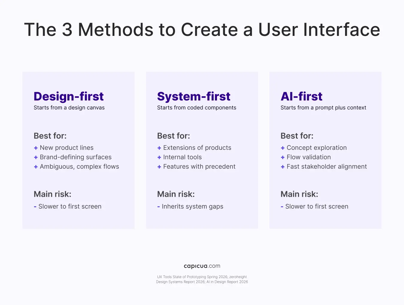
The three methods to create a user interface are design-first, system-first, and AI-first. Each starts from a different artifact (a canvas, a component library, or a prompt), and each fits a different level of ambiguity in the problem being solved. Teams searching for a 3 method create user interface framework usually find tool lists. The more useful lens for a product leader is the starting artifact, because it shapes how fast a team learns and how expensive it becomes to change direction later.
Design-first User Interfaces
Design-first means the team researches, maps flows, and resolves layouts in a design tool before code is written. With UX Tools' State of Prototyping Spring 2026 finding that Figma is still used weekly by 82.6% of respondents, it remains the default for ambiguous problems. Use it for new product lines, brand-defining surfaces, and complex workflows where the main risk is building the wrong thing.
System-first User Interfaces
System-first means the team assembles the interface directly from an existing design system of tokens and coded components, with designers often working in the codebase. It fits extensions of a mature product, internal tools, and features with plenty of precedent. Its speed depends entirely on the system's health, with a Design Systems Report 2026 finding that only 7% of teams report full adoption of their design system.
AI-first User Interfaces
AI-first means teams generate screens, flows, or working prototypes from prompts, then refine the output. Adoption is real and uneven. In the State of Prototyping Spring 2026 survey, 43.8% of designers stated that they spend more than half their building time on AI-generated code, while 37.7% do none at all. The AI in Design Report 2026 adds that working prototypes are now an expected design output for 43% of respondents.
Mature teams run all three and choose per surface: a billing settings page can come straight from the system, but an AI-assisted onboarding flow deserves a design-first pass. A new concept can start as ten AI prototyping directions that the team narrows in an afternoon.
How to Use AI to Create a User Interface Without Losing Quality
Using AI to create user interfaces means treating AI as an option generator and a prototype builder, while people own the problem definition, the quality bar, and the final call. The teams getting value from AI UI generation load their design system and standards into the tools before they prompt.
The AI in Design Report 2026, based on more than 900 designers surveyed in the first quarter of 2026, found 91% use AI in their design work at least weekly, up from 54% a year earlier, and the average AI toolstack grew from three tools to seven. The same research found 62% cite inconsistent or unreliable output as their biggest challenge, while 80% say reliably high-quality output is what makes a tool stick.
Trust follows the same pattern. In the UX Tools survey, 32.8% of designers trust AI output for production after a review pass, while only 1.4% trust it with no oversight. The space between those numbers is where product leaders should place governance.
AI-generated interfaces demand four guardrails:
- Write the brief before the prompt: Define the user, the job, the constraints, and the edge cases first so the model solves a named problem.
- Feed the system along with the request: Load tokens, components, and content rules into the tool so every output starts on brand.
- Generate wide, then decide narrow: Use AI to explore many directions quickly, and reserve human time for choosing and refining one.
- Review like production code: Prototypes that move toward release go through the same design review, accessibility checks, and code review as everything else.
For products that will serve generated interfaces to end users at runtime, the governance question gets sharper. Capicua's guide to generative UI strategy covers how components, ownership, and measurement change when generative UI assembles interfaces per request.

How to Create a User Interface for a New Application In 7 Steps
To create a user interface for a new application, define the job and the decisions first, map flows and states, choose a method per surface, build on tokens and components, prototype with real data, build in accessibility, and instrument the release. The sequence below is how Capicua approaches new applications inside scaling products.
- Frame the job and the success metric: Name the user, the task, and the one outcome the interface must move. A discovery session is the fastest way to align product, design, and engineering on that before anyone opens a tool.
- Map flows and states before screens: List every state, including empty, loading, error, partial, and permission-limited views. Missing states are where most UI rework hides.
- Choose a method for each surface: Design-first where the problem is ambiguous, system-first where precedent exists, and AI-first for fast exploration.
- Set tokens and components early: Agree on color, type, spacing, and core components before the screen count grows.
- Prototype with realistic data: Test flows with real content volumes and real accounts. For example, teams can build prototypes inside the product with real customer data to surface edge cases early.
- Build accessibility in from the first component: The WebAIM Million 2026 found WCAG 2 failures on 95.9% of the top one million home pages, with low-contrast text on 83.9%. WCAG 2.2 sets a 24x24 CSS pixel minimum for pointer targets at level AA.
- Instrument and review before you scale: Release to a limited audience, watch task completion and drop-off, and fix structural issues while the screen count is still small.
For teams building an entire product rather than a single application surface, Capicua's SaaS product playbook covers the broader sequence, and the companion guide on improving user interface design picks up once the first version is live.
How Do Design Systems Speed Up User Interfaces?
A design system speeds up every method of creating a user interface by turning repeated decisions into reusable tokens and components that designers, engineers, and AI tools can all draw from. Without one, each method produces its own inconsistencies; with one, the methods reinforce each other.
40% of the respondents of the AI in Design Report 2026 say their PMs and engineers are doing more design work, and designers are responding by encoding components and brand guidelines into coding tools so everyone starts from a shared quality baseline. Design systems and tokens ranked third among next-year investment priorities at 40.2%, behind AI-generated coding and agent workflows.
The gap is maintenance: 61% of design system teams describe themselves as understaffed, and only about four in ten have an automated token pipeline. A system that drifts from production becomes a source of rework, which is why system health belongs in the same conversation as technical debt management.
A design system needs four things covered to support AI-first work:
- Design tokens named by purpose, so tools apply the right value in the right context.
- Coded components that match design files one-to-one, so a generated screen and a designed screen render identically.
- Usage rules and content guidelines written clearly enough for a model to follow.
- Accessibility defaults built into components, so compliance scales with every new screen.
Which Metrics Show a New User Interface Is Working?
The metrics that show a new user interface is working are task success, time to first value, accessibility errors, interface performance, and rework rate. Together, they tell a product leader whether the interface helps people finish real work and whether the team can keep improving it cheaply.
- Task success rate: the share of users who complete the core job without help.
- Time to first value: how long it takes a new user to reach the outcome the interface was built for.
- Accessibility errors per release: tracked automatically, then reviewed manually for the issues automation misses.
- Core Web Vitals: the HTTP Archive Web Almanac found just 48% of mobile sites pass all Core Web Vitals, against 56% on desktop, so performance belongs on the interface scorecard alongside usability.
- UI rework rate: the share of shipped screens redesigned within two quarters of release.
Baymard's 2025 review and 2026 research roadmap reports that 67% of mobile sites have mediocre or poor navigation, a structural problem that visual polish cannot repair. For a wider measurement approach across the product, Capicua's guide to product insights explains how to turn signals like these into decisions.
Every method to create a user interface now produces screens faster, making it easier than ever to build the wrong one quickly. Shaped Clarity™ gives teams a shared definition of the problem, the user, and the decision each interface must support before generation starts, so new surfaces adapt as the product learns instead of piling up as rework. Clarity about what should exist is what lets speed in UI creation compound. Discover Shaped Clarity.
Conclusion
Creating a user interface is now constrained by decisions. Design-first, system-first, or AI-first methods work when matched to the right level of ambiguity, and fail when used as the default for everything. As generation gets cheaper, the advantage moves to teams that know which interface should exist and why. That's a strategy question as much as a design one, and it is worth answering before the next prompt.
To create a user interface your users adopt and your team can evolve without rework, contact us or book a call.